Building a Distraction-Free Smart Home Dashboard with an E-Ink Display and Solid Wood
 Pedro Arian Viena··Updated July 20, 2026·26 min read
Project Specifications & Materials
Why I Removed the iPad From My Wall and Built Something That Actually Belonged There There was a moment when I realized my smart home was becoming less smart. Not because the technology failed. Actually, the opposite. Everything worked. The lights responded. The cameras loaded instantly. The thermostat was connected. The server status was available. The automation routines were running perfectly. The problem was the interface. I had created a system designed to make my home calmer, but the thing I used to control it was a glowing rectangle permanently attached to the wall. An iPad. At first, it seemed like the perfect solution. A beautiful touchscreen. A modern interface. Access to everything. It felt futuristic. But after living with it for a while, something started bothering me. It looked like exactly what it was: A tablet someone had stuck on a wall.
The Problem With Wall-Mounted Tablets
The smart home community has accepted a specific design pattern: Take an old tablet. Mount it somewhere. Install a dashboard. Done. Technically, this works. A tablet is powerful. The screen is beautiful. The software options are almost unlimited. But a home is not a laboratory. It is not an office. It is not a technology showroom. The things we place on walls become part of the architecture. And a glowing touchscreen has a very strong visual presence. Especially at night.
The Screen Was Always There
The biggest issue was not even aesthetics. It was attention. A traditional display constantly asks for your attention. Even with dark mode enabled, an LCD or OLED screen emits light. Your eyes notice movement. Notifications. Brightness changes. Colors. A smart home dashboard that should quietly provide information became another source of stimulation. The irony was impossible to ignore. I had built automation to reduce distractions. Then I installed a device designed to create them.
Why I Didn't Want Another Smart Home Screen
The purpose of a home dashboard is usually simple: Show useful information. Weather. Calendar. Energy consumption. Server status. Security. Lighting scenes. But most modern screens are designed around interaction. They want taps. Gestures. Apps. Notifications. They are excellent computers. They are not necessarily excellent pieces of architecture. I started thinking about what the ideal interface would actually look like. The answer was surprisingly simple. A piece of paper.
The Idea: A Digital Sheet of Paper
Before smartphones, tablets, and smart displays, information lived naturally in our homes. Calendars on walls. Clocks. Notes. Printed schedules. The information was available. But it did not demand attention. That was the feeling I wanted. Something that could show useful information without glowing at me. That led me to E-Ink displays.
Why E-Ink Changed the Entire Concept
E-Ink works differently from traditional displays. Instead of constantly emitting light, it reflects ambient light. The experience is much closer to printed paper. When the screen is not updating, it is not actively consuming energy in the same way an LCD panel does. It simply holds the image. That changes the relationship completely. The dashboard stops feeling like a computer. It starts feeling like an object.
The Difference Between Looking at a Screen and Looking at Information
This distinction became the foundation of the project. A normal display says: "Interact with me." An E-Ink display says: "Here is information." That sounds subtle. But it changes how you use it. The dashboard becomes something you glance at. Not something you open. Not something you scroll through. Not something that interrupts your day.
Designing Around the House Instead of the Technology
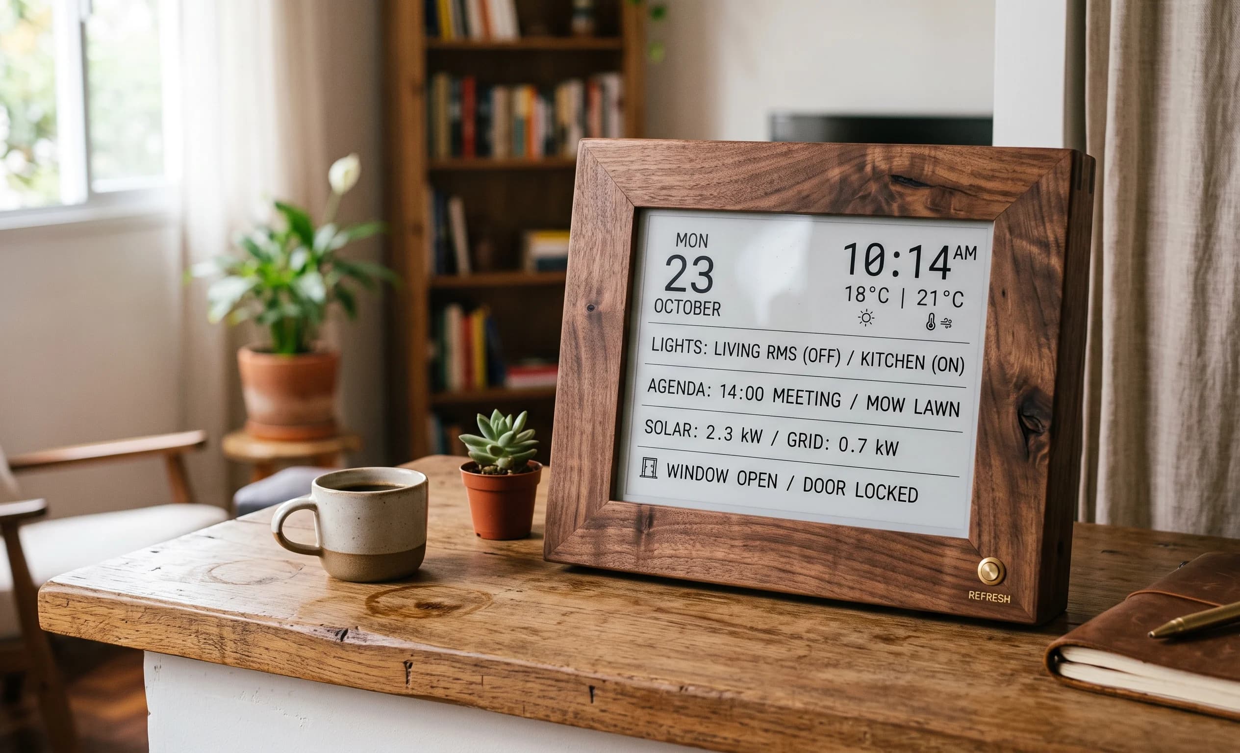
The next challenge was making sure the display did not become another piece of hardware attached to the wall. A bare E-Ink panel would have the same problem as the iPad. It would still look like electronics. The solution was treating it like furniture. A frame. A material. A physical object. I wanted someone walking into the room to see: A beautiful wooden panel. Not: A Raspberry Pi project.
Choosing Solid Wood for the Frame
This is where the woodworking side became important. The frame needed to match the rest of the room. I considered several materials. MDF would have been easier. Plastic would have been cheaper. But neither had the feeling I wanted. The purpose of this project was reducing the visual presence of technology. Real wood helped achieve that. White oak and walnut were the two obvious choices. Both have a timeless quality. Both age well. Both make technology feel less temporary.
The Engineering Challenge Behind a Simple Object
The final dashboard would look extremely simple. A wooden frame. A paper-like screen. A few pieces of information. But simplicity required engineering. Behind that clean appearance would be:
- E-Ink display hardware.
- Raspberry Pi Zero or ESP32 controller.
- Local data processing.
- API connections.
- Power management.
- Wireless communication. The complexity would exist behind the object. Not on the surface.
Why I Chose Slow Information Updates
One of the biggest mindset changes was accepting that this did not need to behave like a tablet. A tablet updates instantly because it is designed for interaction. This dashboard had a different purpose. The information only needed to change when the information changed. Weather. Calendar. Server status. Daily schedule. Refreshing every few minutes was unnecessary. The slower update cycle was actually an advantage. It made the system quieter. More efficient. More intentional.
The First Prototype Looked Nothing Like the Final Product
The first version was ugly. A loose E-Ink panel. Temporary wires. A development board sitting beside it. Nothing about it looked like a premium home object. But functionally, it answered the most important question: Did the concept work? Could a screen provide useful information without becoming a distraction? The answer was yes. The technology was not the problem. The presentation was.
The Moment I Realized This Was Not a Display Project
Halfway through building the prototype, I stopped thinking about screens. The project was no longer about replacing an iPad. It was about changing the relationship between humans and smart homes. Most smart home devices try to make technology more visible. More interactive. More present. This project tried to do the opposite. Make technology quieter. Make information available without demanding attention.
The next stage was designing the actual E-Ink dashboard: choosing the right display size, deciding between Raspberry Pi Zero and ESP32, building the solid wood frame, managing power consumption, and creating a system that could quietly update information without turning into another glowing screen. Designing the E-Ink Dashboard: Choosing the Display, Electronics, and Wood Frame The hardest part of this project was accepting that the technology was not the main character. That sounds strange coming from someone building a smart home dashboard. Usually, these projects start with hardware. Which screen is faster? Which processor is more powerful? Which software has more features? But that mindset leads to the same problem I was trying to solve. Technology becomes visible. The whole reason I removed the tablet from my wall was because it felt like a computer attached to the house. Replacing it with a more advanced computer would not solve anything. The goal was not creating a better screen. The goal was creating a better object.
Choosing the Right E-Ink Display
The first major decision was the display itself. E-Ink panels come in many different sizes and configurations. Some are tiny, designed for small sensors. Others are large enough to create wall-mounted information displays. The temptation was choosing the biggest screen possible. More space. More data. More features. But that would recreate the same problem. A large screen naturally becomes the center of attention. I wanted something closer to a framed print. Something that could exist on the wall without dominating it.
Why I Chose a Monochrome Display
Modern screens have trained us to expect color. Bright interfaces. Animations. High refresh rates. But that was exactly what I wanted to avoid. The purpose of this dashboard was information, not entertainment. A monochrome E-Ink display had several advantages:
- It looked closer to paper.
- It consumed less power.
- It felt calmer visually.
- It matched the idea of a physical object. The limitation became part of the design. Without endless colors and animations, the interface had to become more intentional.
Designing the Interface Like a Printed Page
This was one of the biggest changes compared to designing a normal dashboard. A touchscreen encourages complexity. Buttons. Menus. Interactive elements. An E-Ink display does not. The layout needed to work at a glance. The same way a well-designed printed page works. The information hierarchy became more important than the technology. The most useful elements were things like:
- Current weather.
- Daily calendar.
- Smart home status.
- Server health.
- Energy information. Not everything needed to be displayed. Only information worth seeing.
The Difference Between Data and Information
This was something I had to learn during the design process. A smart home generates enormous amounts of data. Temperature sensors. Energy readings. Network information. Device states. But displaying everything is not useful. A dashboard overloaded with information becomes another source of noise. The purpose was not showing everything the system knew. The purpose was showing what actually mattered. That required removing more than adding.
Choosing Between Raspberry Pi Zero and ESP32
The next decision was the brain behind the display. There were two obvious options. A Raspberry Pi Zero. Or an ESP32. Both could handle the project. But they represented different philosophies.
Raspberry Pi Zero: The Flexible Option
The Raspberry Pi Zero offered more computing power. It could run a complete operating system. It could handle:
- Complex layouts.
- Web requests.
- Image generation.
- Advanced scripts.
- Multiple services. For a highly customized dashboard, it was attractive. The downside was complexity. A full Linux system means: More maintenance. More updates. More potential points of failure.
ESP32: The Efficient Option
The ESP32 represented a simpler approach. It is not a small computer trying to imitate a desktop. It is a microcontroller designed for specific tasks. That made it interesting for this project. The dashboard did not need: A browser. A desktop environment. A powerful processor. It needed: Connect to Wi-Fi. Fetch data. Update the display. Sleep. Repeat. The simplicity matched the philosophy of the project.
The Final Decision: Match the Hardware to the Purpose
This was the most important engineering decision. Not choosing the most powerful hardware. Choosing the hardware that fit the problem. A smart home dashboard that updates every fifteen minutes does not need a powerful machine running constantly. The slower, simpler system was actually better. Less energy. Less heat. Less maintenance. More reliability.
Understanding E-Ink Power Consumption
One of the biggest advantages of E-Ink is how differently it uses energy. Traditional screens consume power continuously. Even when displaying a static image, they need electricity to maintain the display. E-Ink works differently. Once the image is updated, it can remain visible without constantly refreshing. That makes it ideal for information that changes slowly. A calendar. Weather. Daily schedule. System status. Exactly the type of information a home dashboard should show.
The Challenge of Refreshing E-Ink Correctly
E-Ink is not perfect. The same characteristic that makes it efficient creates limitations. It does not refresh like an LCD. Updates are slower. Transitions can look different. Some panels require careful refresh handling to avoid ghosting. This meant the software needed to understand the hardware. The display could not simply be treated like a normal monitor.
Designing the Wooden Frame
Once the display choice was made, the woodworking became the next challenge. The frame had one important job: Make electronics feel like furniture. The screen itself was thin. The electronics behind it were not. The frame needed enough depth to hide:
- Controller hardware.
- Wiring.
- Connectors.
- Mounting points. But it could not look like a thick electronics enclosure. The proportions mattered.
Choosing Between White Oak and Walnut
The wood choice depended heavily on the environment. White oak created a lighter, more Scandinavian feeling. It made the display feel like a modern architectural detail. Walnut created something warmer and more traditional. It made the technology feel almost like a piece of vintage furniture. Both worked. The important part was choosing a material that already belonged in the room.
Building the Frame Like Picture Furniture
One mistake would have been building a simple wooden box. That would immediately reveal the DIY nature of the project. Instead, I approached it like a picture frame. The front needed clean edges. The joints needed to disappear. The finish needed to feel intentional. The screen was not the product. The frame was what made the object belong.
The Hidden Electronics Problem
A wall-mounted object creates a unique challenge. Everything must fit behind the surface. The frame needed to hide:
- The controller.
- Power conversion.
- Cable connections.
- Wireless components. At the same time, it needed to remain serviceable. This is where many beautiful DIY projects fail. They look perfect on day one. Then a component fails and the entire object has to be destroyed. I designed access into the structure from the beginning.
Mounting the Display Without Making It Permanent
Another small but important detail was the screen mounting. E-Ink panels are fragile. They are not designed to handle mechanical stress. The frame needed to hold the display securely without applying pressure. The solution was creating a gentle mounting system. Enough support. No unnecessary force. This is the kind of detail that separates a prototype from a finished product.
The First Wooden Prototype
Like every project, the first physical version exposed problems. The frame looked good. The display worked. But the proportions felt wrong. It was slightly too deep. The viewing angle was not ideal. The cable exit was inconvenient. These are problems impossible to discover in software. The physical object has to exist before you truly understand it.
The Moment the Dashboard Started Feeling Like Furniture
After adjusting the frame, something changed. The display stopped looking like electronics. It looked intentional. A wooden object on the wall. A piece of information architecture. That was the moment the project reached its original goal. The technology was still there. But it stopped being the focus.
The next stage was building the final version: crafting the solid wood enclosure, installing the E-Ink panel, programming the Raspberry Pi Zero or ESP32, connecting real-world data sources through APIs, and creating a dashboard that updates quietly in the background without ever becoming another distraction. Building the Solid Wood Enclosure, Programming the Display, and Connecting Real-Time Data The biggest difference between a normal electronics project and a piece of furniture is that furniture has to survive being seen. A prototype can have exposed wires. A development board sitting on a desk. Temporary connections everywhere. Nobody cares because the goal is proving the idea. But the moment something goes on a wall inside a home, the standard changes. Every edge matters. Every gap matters. Every cable matters. The technology has to disappear completely. That was the challenge with the final build. The E-Ink panel itself was already doing most of the visual work. It looked calm. It looked simple. The wooden enclosure had to protect that simplicity instead of competing with it.
Building the Solid Wood Frame
The frame started as a piece of raw hardwood. At this stage, it looked nothing like a smart home device. That was exactly what I wanted. The goal was creating an object that could exist even without the electronics. A piece of furniture. A wooden panel. Something that would still make sense if someone did not know there was a computer hidden behind it. I chose solid wood instead of manufactured materials because of how it ages. A smart device can become outdated. A well-made wooden object becomes more valuable over time.
Milling the Wood and Preparing the Joinery
The first step was preparing the boards. The dimensions needed to be precise because E-Ink panels are unforgiving. Unlike a painting, where a frame can hide small inconsistencies, a digital display reveals alignment problems immediately. The corners needed to be clean. The front surface needed to remain perfectly flat. The depth needed to hide electronics without making the object look bulky. This was one of those situations where woodworking accuracy directly affected the technology.
The Mistake I Almost Made With the Frame
One of the early mistakes was making the enclosure too shallow. On paper, it looked better. A thinner profile. A cleaner appearance. But real hardware does not care about aesthetics. The display connector needed space. The controller needed airflow. The cables needed room to bend without stress. I had to increase the depth slightly. The final version was not the absolute thinnest possible. It was the thinnest version that was practical. That distinction matters in real projects.
Creating Space for the Electronics
Behind the E-Ink panel, the frame needed to become a hidden electronics compartment. The challenge was keeping everything organized. Inside the enclosure were:
- The display controller.
- The ESP32 or Raspberry Pi Zero.
- Power regulation.
- Connection points.
- Mounting hardware. A messy interior creates future problems. Even if nobody sees it. A good build has the same discipline inside and outside.
Designing for Repair Instead of Perfection
This is something many DIY creators ignore. They focus entirely on the first day. The finished photos. The clean installation. But electronics fail. Components get replaced. Software changes. A system that cannot be opened is not truly finished. I designed the back panel so I could access the important parts without destroying the frame. The goal was not hiding everything forever. The goal was hiding everything while keeping control.
Mounting the E-Ink Panel
Installing the display required patience. E-Ink panels are not like glass screens. They are thinner. More delicate. They can be damaged by uneven pressure. The mounting system needed to hold the display securely while allowing small amounts of flexibility. Too loose: The panel moves. Too tight: The display can be damaged. Finding that balance took some adjustment.
Finishing the Wood
The finish completely changed the character of the object. Before finishing, the frame looked like a workshop project. After finishing, it looked like something designed for the home. I avoided overly glossy finishes. A high-gloss surface would make the frame feel like a decorative object instead of a natural material. The goal was preserving the texture of the wood. Something that felt warm and permanent.
The Hidden Power Challenge
A wireless device still needs power. This was one of the biggest practical questions. How do you power a wall-mounted object without ruining the appearance? A visible cable immediately destroys the illusion. The solution depends on the installation. Some people can hide wiring inside walls. Others may need a carefully routed cable path. The important part is planning before mounting. A beautiful object with a random cable hanging below it is still unfinished.
Choosing Between Continuous Power and Battery Operation
At first, battery operation sounds attractive. No wires. Complete freedom. But there is a reason many E-Ink projects still use external power. A battery-powered device requires more compromises. Battery size. Charging cycles. Brightness limitations. Maintenance. Because the display updates infrequently, power consumption is already very low. A clean hidden power connection often creates the better long-term solution.
Programming the Dashboard Logic
Once the physical build was complete, the software side became the focus. The dashboard did not need to behave like a traditional app. That was important. The software had one job: Collect useful information. Format it beautifully. Update the display. Sleep. Repeat. The simpler the system, the more reliable it became.
Pulling Data From APIs
The dashboard connected to different information sources. Examples included: Weather data. Calendar events. Server monitoring. Smart home status. The important part was not collecting everything. It was choosing information that was actually useful. A dashboard should answer small daily questions. What is the weather? What is happening today? Is everything working? Not: How much data can I display?
Creating a Local-First Architecture
One of the biggest advantages of using ESP32 or Raspberry Pi hardware was keeping control local. The dashboard did not need to depend on a company's ecosystem. It could communicate directly with: Home Assistant. Local network services. Self-hosted applications. This matched the entire philosophy of the project. The device should belong to the home. Not exist as a rented service controlled by someone else.
The Fifteen-Minute Update Strategy
This was where E-Ink completely changed the design philosophy. A normal screen tries to update constantly. An E-Ink dashboard does not need that. Refreshing every few seconds would be pointless. The information does not change that quickly. A fifteen-minute update interval was enough for most data. Weather. Calendar. System status. The result was lower power consumption and a calmer experience.
Designing the Software Around the Display Limitation
The display limitation actually improved the interface. Because updates were slower, I stopped designing like a website. No unnecessary animations. No moving elements. No distracting transitions. The interface became more like a printed dashboard. Clear. Simple. Intentional. The limitation created better design decisions.
The First Complete Wall Test
The first time I mounted the finished dashboard was the real moment of truth. On the workbench, it was impressive. On the wall, it had to belong. The screen updated. The wood matched the room. The information was visible. But the device itself disappeared. That was the goal. Nobody walking into the room would immediately think: "There is a Raspberry Pi behind that." They would simply see a well-designed object.
The Unexpected Lesson From the Build
The most surprising part was realizing that the technology became less important as the project improved. The better the engineering became, the less visible it was. The cables disappeared. The interface simplified. The screen stopped glowing. The hardware became silent. The project succeeded by removing itself from attention.
At this stage, the E-Ink dashboard was complete technically: a solid wood frame, a paper-like display, local data processing, and smart home integration working together. The final test was not building it. The final test was living with it. Seeing whether a slower, quieter interface actually improved daily life compared to the always-on screens we have become used to. Living With an E-Ink Smart Home Dashboard: What Worked, What Failed, and Why Less Technology Became Better The first few days with the finished dashboard were interesting because I kept expecting to interact with it. That was the habit created by years of using tablets and smartphones. I would walk past it and instinctively think: "Should I tap something?" "Should I open another page?" "Should I check another piece of information?" But there was nothing to do. And that was exactly why the project worked. The dashboard was not designed to become another device demanding attention. It was designed to quietly exist. After a few weeks, the most noticeable thing about it was not what it showed. It was what it stopped doing. It stopped glowing. It stopped interrupting. It stopped feeling like a computer attached to the wall.
The Unexpected Psychological Effect of Removing Light
The biggest difference between the E-Ink dashboard and a traditional smart display was not technical. It was emotional. Modern homes are surrounded by screens. Phones. Televisions. Computers. Tablets. Smart speakers with displays. Almost every device competes for attention. Even when they are not actively being used, they create a sense of digital presence. The E-Ink panel changed that relationship. At night, it did not become another glowing rectangle in the room. It simply reflected the available light like paper. The room felt calmer.
Why I Stopped Missing the Touchscreen
This was the biggest surprise. I expected losing touch interaction to feel limiting. It did not. In fact, it forced the dashboard to become better. A touchscreen encourages endless possibilities. More pages. More controls. More information. But most of that is unnecessary. The things I actually wanted to know were simple. What is the weather? What is happening today? Is the server healthy? Is something important changing? For those questions, touching the screen was never the important part. Seeing the answer was.
The Dashboard Became More Like a Clock
A good clock does not need an app. It does not need notifications. It does not need a login. It simply provides useful information instantly. The E-Ink dashboard started feeling similar. It became part of the room. Something I naturally looked at while walking by. The information was available without requiring a decision. That small difference had a bigger impact than I expected.
The Biggest Mistake I Made Was Adding Too Much Information
During development, I made the same mistake many people make with dashboards. I tried to include everything. More sensors. More statistics. More system information. More data. Technically, it looked impressive. Practically, it was worse. The display became crowded. The hierarchy disappeared. The dashboard started feeling like a monitoring screen from a server room. That was the opposite of what I wanted.
Removing Information Made It More Useful
The final version showed less. But the information became more valuable. The layout became cleaner. The important elements became obvious. The dashboard was no longer trying to prove what the system could do. It was focused on what the person actually needed. That is a lesson that applies to almost every smart home project. More capability does not always create a better experience. Sometimes the best upgrade is removing things.
How the E-Ink Display Changed My Smart Home Philosophy
Before this project, I thought smart homes were about adding intelligence. More devices. More integrations. More automation. After building this, my perspective changed. A truly smart home is not one that has the most technology. It is one where technology creates less friction. The dashboard was successful because it reduced interaction. It answered questions without creating new tasks.
Reliability After Months of Use
The most important test of any smart home project is time. A system can work perfectly for one day. That proves almost nothing. The real question is: Does it continue working after months? The E-Ink dashboard performed well because the architecture was simple. There were fewer moving parts. No constantly running bright display. No heavy operating system doing unnecessary tasks. No dependence on cloud services for basic functionality. The simplicity became an advantage.
The Reality of E-Ink Limitations
E-Ink is not perfect. It has limitations that are important to understand. The refresh rate is slow. Animations are not practical. Large visual changes take time. The display is not designed for video or fast interaction. But those limitations were actually compatible with the purpose of this project. A kitchen knife is not worse because it cannot cut wood. It was designed for a specific job. E-Ink was designed for information that stays visible.
What I Would Change in Version Two
If I built another version, I would improve a few details. The first would be creating a more modular internal design. Electronics change quickly. A controller that works today may be replaced tomorrow. Making upgrades easier would increase the lifespan of the object. The second improvement would be experimenting with larger formats. Not because bigger is always better. But because certain rooms benefit from larger information displays. The important thing would still be maintaining the same philosophy: Quiet technology. Not a giant screen.
The Importance of Designing for the Future
One thing I learned from woodworking projects is that permanence requires flexibility. A piece of furniture can last decades. Electronics usually cannot. That creates an interesting challenge. How do you combine something timeless with something temporary? The answer is making the technology replaceable. The wood should survive longer than the computer inside it. The frame should remain valuable even when the electronics evolve.
Why I Would Never Mount an iPad Again
After living with this system, going back to a wall-mounted tablet would feel strange. Not because tablets are bad. They are excellent devices. But they solve a different problem. An iPad is designed to be interacted with. A smart home dashboard should often be designed to be observed. That difference changes everything. The tablet brought a computer into the room. The E-Ink display became part of the room.
The Bigger Lesson About Smart Homes
The future of smart homes will not simply be about making everything connected. Connectivity is easy now. The difficult part is creating technology that respects the human environment. A home is not a smartphone. It does not need constant updates. It does not need notifications everywhere. It does not need every surface to become interactive. Sometimes the smartest technology is the technology that knows when not to demand attention.
Final Thoughts: Building Something That Almost Disappears
The most satisfying part of this project is that people rarely notice it. They notice the wood. They notice the clean design. They notice that the room feels organized. But they do not immediately notice the electronics. And that is exactly the outcome I wanted. The Raspberry Pi or ESP32 is not the achievement. The API integration is not the achievement. The E-Ink panel is not even the achievement. The achievement is creating an interface that gives information without adding noise. A smart home should not feel like living inside a technology showroom. It should feel like a well-designed space where technology quietly works in the background. The iPad on the wall was impressive. For a while. But eventually, it reminded me that I was looking at a device. The E-Ink dashboard does something completely different. It reminds me of the information I need. Then it disappears again. And after building dozens of smart home projects, that might be the most important lesson I have learned: The best technology is not the technology that gets noticed. It is the technology that makes everything around it better.
About the Author

Pedro Arian Viena
Maker & Smart Living Craftsman
Craftsman and home designer passionate about solid wood joinery, custom furniture fabrication, architectural built-ins, and local smart home automation. I write detailed guides on building beautiful, functional living spaces.